I thought that the way they created the credits was also very interesting and entertaining because of the way they have tried to match the sequence with the actual credits title. For example:
What is also effective is the choice of colours used; in a recent interview by Florence Deygas this is what he had to say about this:
The color palette does so much to set the feel of the jet setting era in which the film takes place. Was there an intentionality to the colors that you selected and if so, what materials did you reference?
The film takes place in the 1960s and Spielberg desired for us to transplant the audience into a varied universe, with a bit of chic and a sense of drama (certainly not a humorous cartoon). We decided to take on the same approach as those who created title sequences during that era: as if we were in that era, working amongst colleagues. Not in terms of technological means, but in terms of philosophy. We wanted to deliver a personal creation that has our mark, that works in contrast to studio title sequences in which the artist’s hand is less visible. We wish to have the audience of this film rediscover a paradise lost.
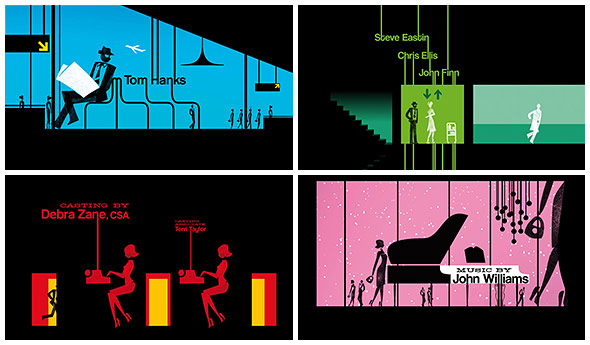
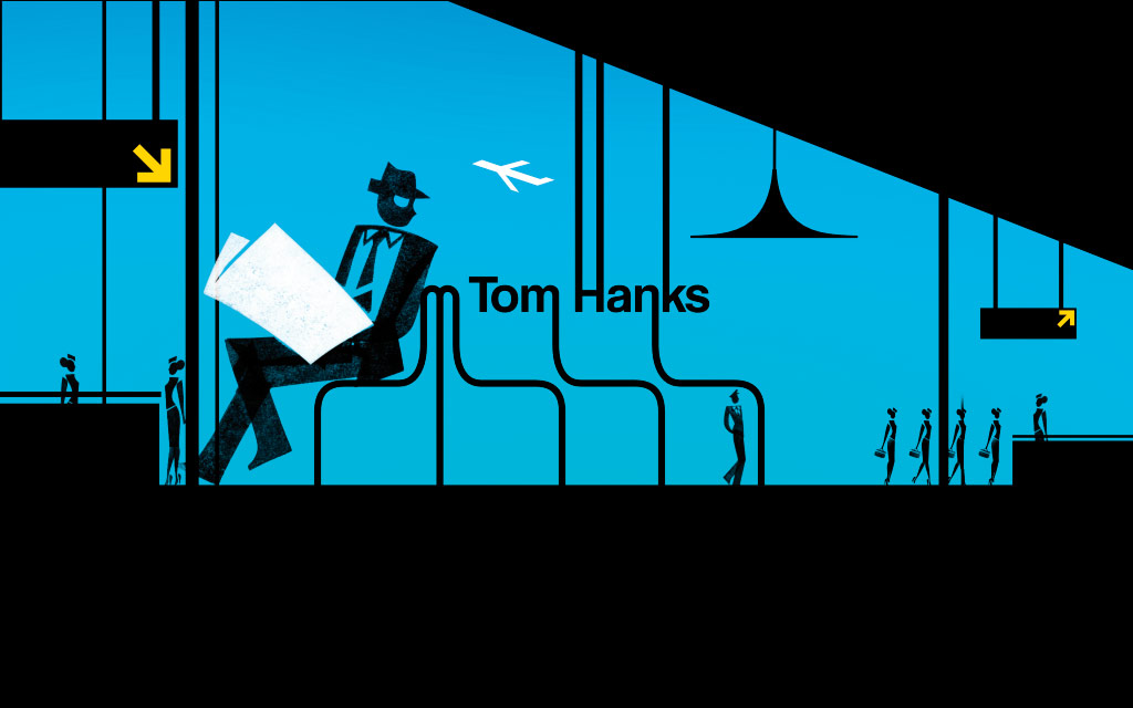
Color palette examples from final sequence
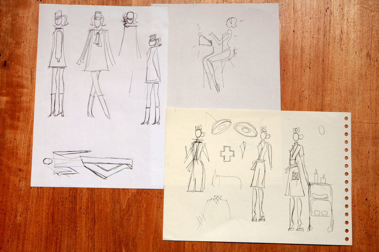
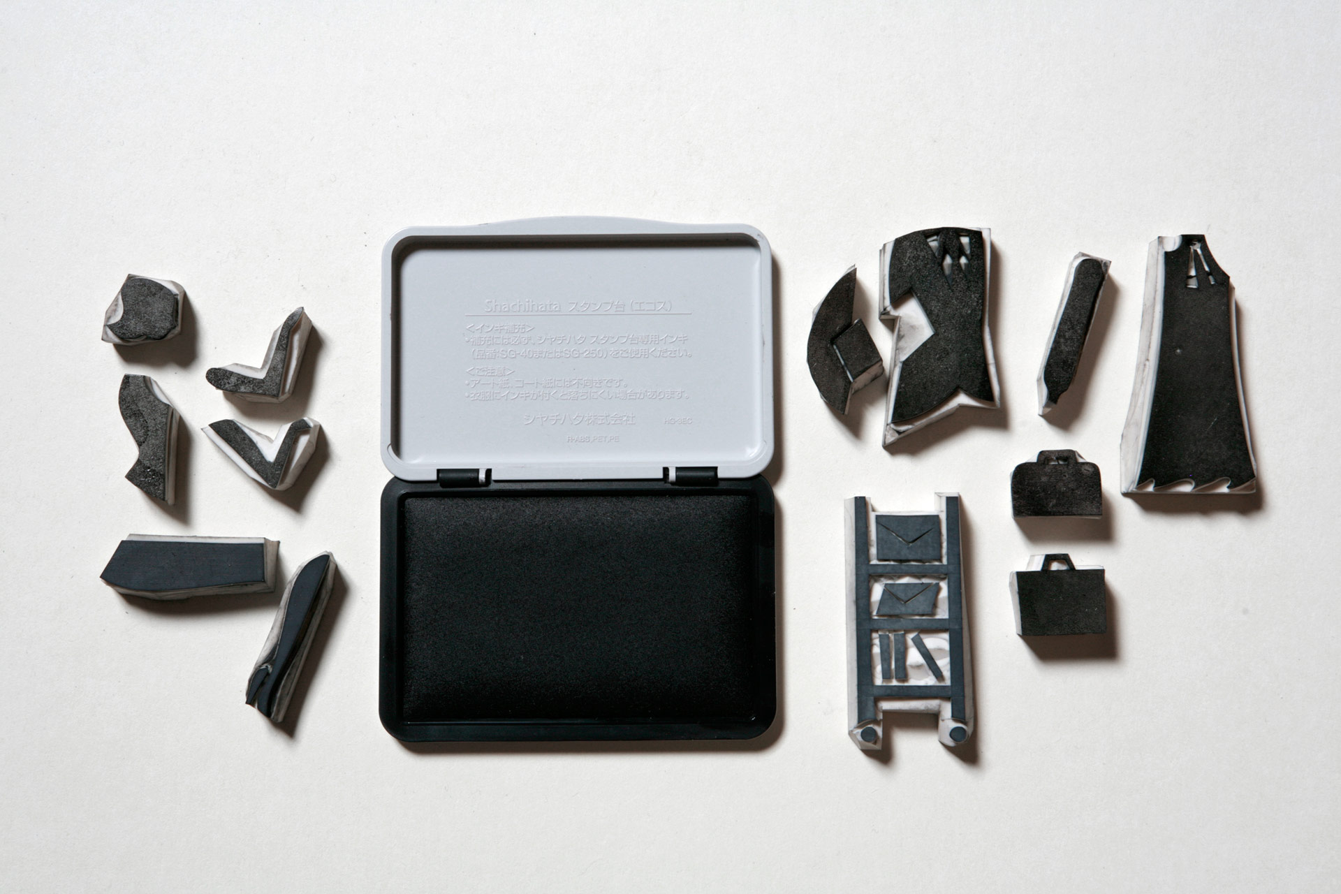
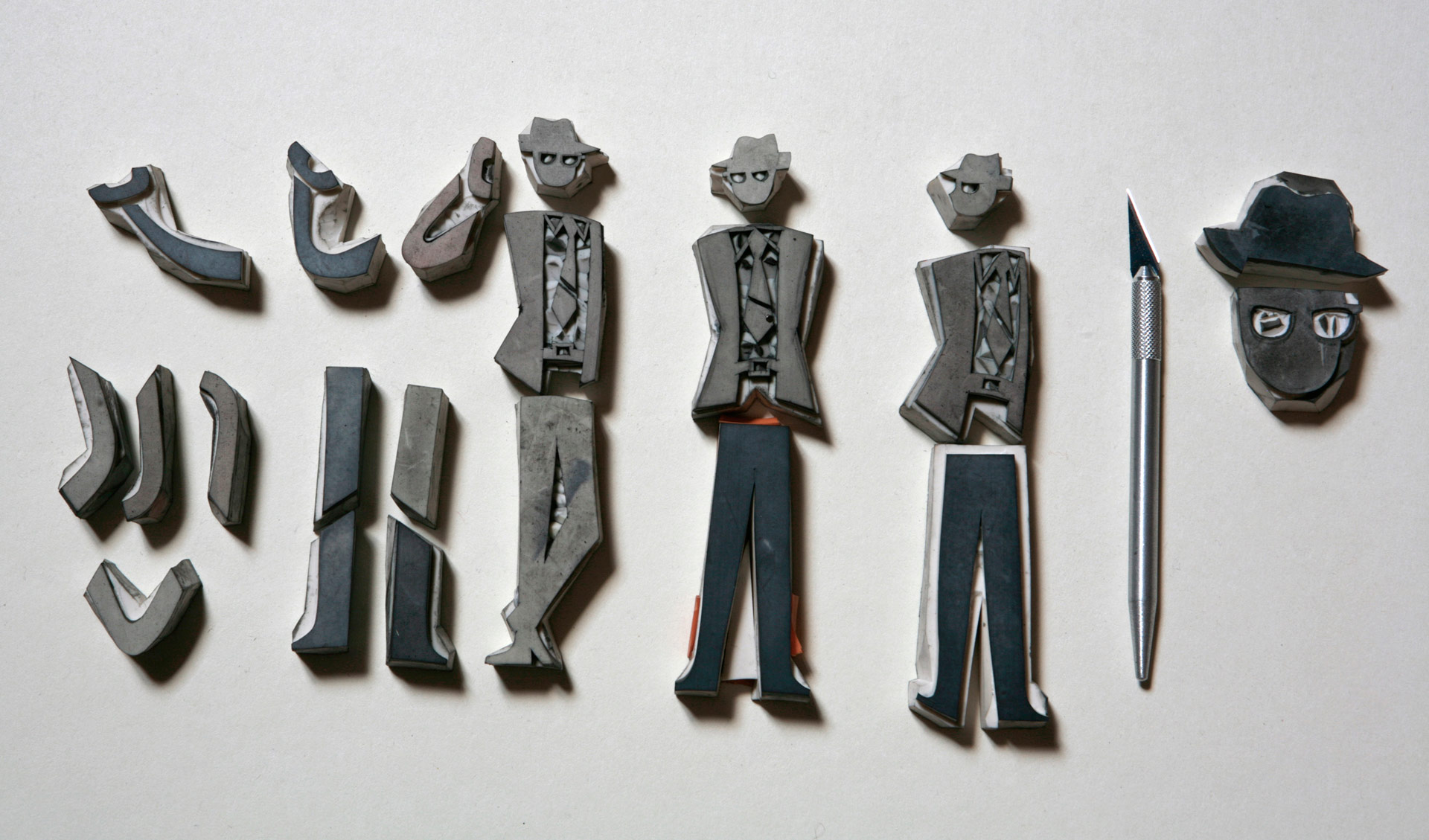
The colours signal geographical and temporal transitions. The silhouettes stem from our own graphic vocabulary with a sixties twist so it adheres to the subject matter. We decided to employ them here for their symbolic force. The silhouette evokes a character we all ignore — the hero is a trickster. Those are in fact hand-carved stamps, animated in a traditional manner on paper by hand. That “handmade” aspect belongs to title sequences of that era.
Embedding such lovely handmade animations into a precise, down-to-the-millimetre décor on a computer served as a bridge between the past and the present. The audience was able to taste a remnant of that past through the visual comfort of which they are used to today.
No comments:
Post a Comment