Monday, February 25, 2013

Catch Me If You Can


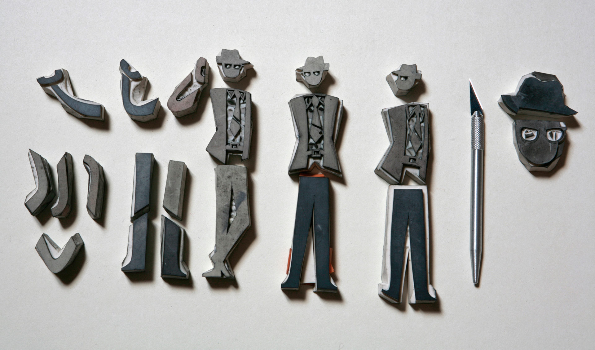
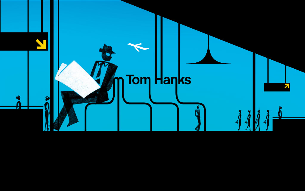
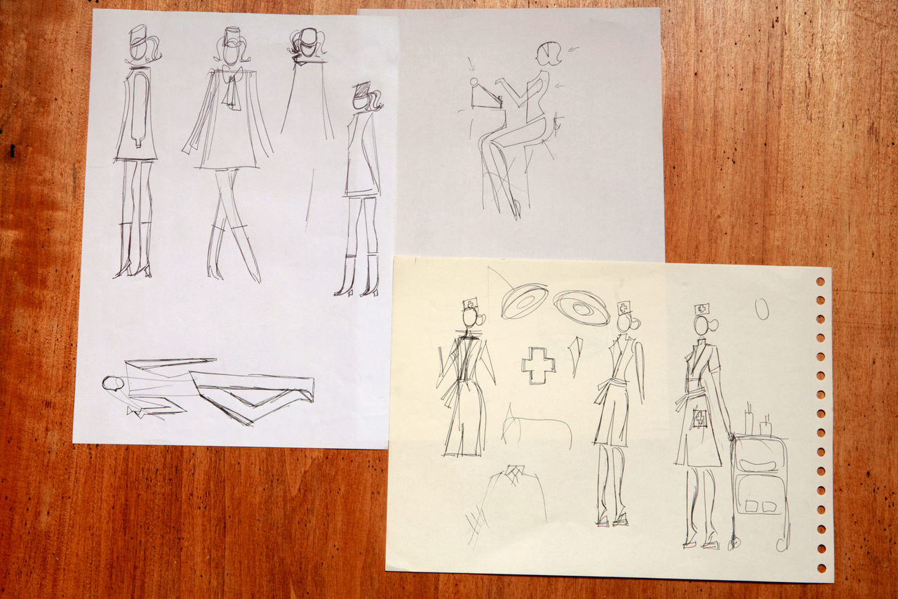
The action of this title sequence is supposed to take place between 1963 and 1969. I think that the music matches this style very well, because, not only does it create a feeling of being around that time period, but at times the orchestra will range from being high to low pitched which creates this running feeling and so it matches title.  I like how the title sequence is very plain and consists of mainly white, blue and black which creates the sense that it is quite formal and therefore the target audience would not be for younger people but adults or older teens. The title sequence is also effective because the tall long black letters match the tall, stick black characters we are shown, and the fact that the letters on the title are extended further matches the name of the film which is about trying to 'catch' someone. I also like how the opening sequence does not consist of real people but it is also like a cartoon, and the swanky music further creates a sense of excitement. Here is a picture of the drawings before the actual sequence was made:


I thought that the way they created the credits was also very interesting and entertaining because of the way they have tried to match the sequence with the actual credits title.  For example: 


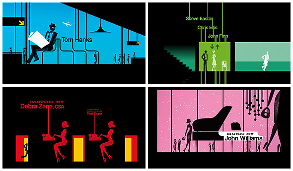
What is also effective is the choice of colours used; in a recent interview by Florence Deygas this is what he had to say about this: 


The color palette does so much to set the feel of the jet setting era in which the film takes place. Was there an intentionality to the colors that you selected and if so, what materials did you reference?
The film takes place in the 1960s and Spielberg desired for us to transplant the audience into a varied universe, with a bit of chic and a sense of drama (certainly not a humorous cartoon). We decided to take on the same approach as those who created title sequences during that era: as if we were in that era, working amongst colleagues. Not in terms of technological means, but in terms of philosophy. We wanted to deliver a personal creation that has our mark, that works in contrast to studio title sequences in which the artist’s hand is less visible. We wish to have the audience of this film rediscover a paradise lost.

VIEW 4 IMAGES
Color palette examples from final sequence

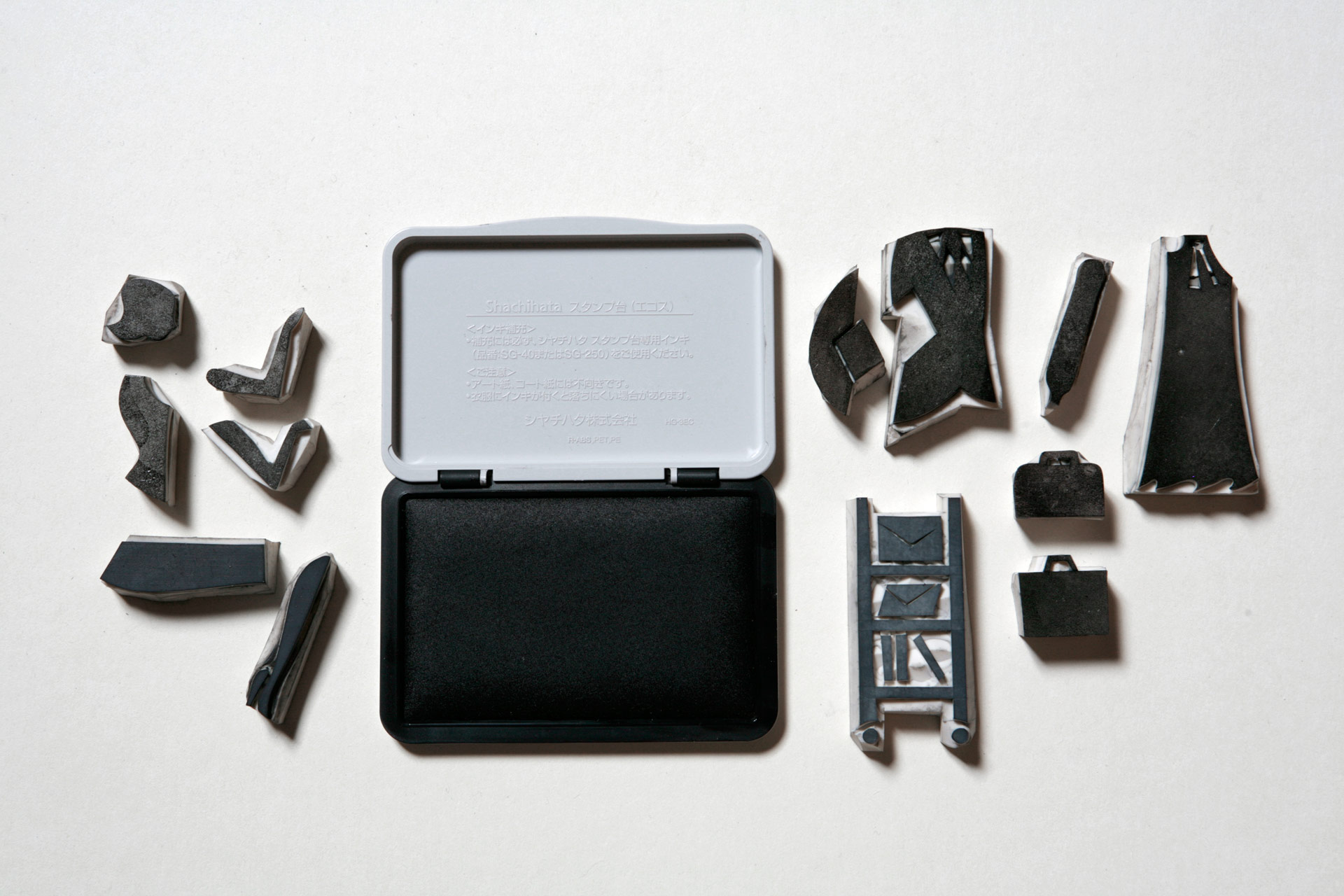
The colours signal geographical and temporal transitions. The silhouettes stem from our own graphic vocabulary with a sixties twist so it adheres to the subject matter. We decided to employ them here for their symbolic force. The silhouette evokes a character we all ignore — the hero is a trickster. Those are in fact hand-carved stamps, animated in a traditional manner on paper by hand. That “handmade” aspect belongs to title sequences of that era.
Embedding such lovely handmade animations into a precise, down-to-the-millimetre décor on a computer served as a bridge between the past and the present. The audience was able to taste a remnant of that past through the visual comfort of which they are used to today.

Update

We have been unable to do any group work for the last 2 weeks because the Macs got stolen. This means that our editing work is lost and so we need to re-do this again which is annoying as we did finish it the first time round. However, now that the Macs have arrived, tomorrow we will need to start editing again in order to get this finished and to the standard we want it to be. This does mean that we have to work as harder and have more lunch/ free periods/ after school sessions in order to get this done in time and as good as we had it before. Despite this, I think we all know exactly how we want the sequence to be as we have had it completed the first time, and so it wouldn't be too much of a hassle. 

Friday, February 15, 2013

Credits

In the creative arts, credits are an acknowledgment of those who participated in the production.  They are often shown at the end of movies and on CD jackets. In film, television, theatre, etc. the names of actors and behind the scenes staff who contributed in this production. 

Opening Credits

The opening credits show the most important people at the beginning i.e. the actors that are taking part, the director, producer editor and more.  They are usually shown on a blank screen, at the bottom/ top of action and even next to the characters and where the action is taking place. This for me makes it more visually interesting and we are able to see exactly who the characters are, and doesn't bore the audience by looking at just plain text on a plain background, but the action keeps their attention drawn to the movie.

Opening credits since the 1980s, identify the major characters and crew, while the closing credits list the extensive cast and production crew. Here is a typical way of how credits are being layed out:

Common opening credits order

While there are numerous variations most opening credits use some variation of the basic order[4] noted within:
  • (NAME OF THE STUDIO)
Name of the studio that is distributing the film and may or may not have produced it (Walt Disney Pictures, Columbia, Lions Gate, Universal, Marvel Studios, Dimension, Miramax etc.).
  • (NAME OF THE PRODUCTION COMPANY)
Name of the production company that actually made the film or name of the investment groups or companies that financed a substantial part of the film (usually credited as "in association with" or "A (studio name) production.").
  • (PRODUCER NAME) PRODUCTION or/and (director only) A FILM BY (DIRECTOR NAME)
Director's first credit, often "a film by XY or "a XY film".
  • STARRING
Principal actors and the most important cast in the film.
  • (FILM'S TITLE)
Name of the film.
  • FEATURING
Featured actors
  • CASTING or CASTING BY
Casting Director
  • MUSIC or MUSIC COMPOSED BY or ORIGINAL SCORE BY
Composer of music
  • PRODUCTION DESIGN or PRODUCTION DESIGNER
As a variation some of the below may be noted:
  • SET DESIGN
  • COSTUMES or COSTUMES BY or GOWNS (older movies)
  • HAIRDRESSER
  • MAKE-UP ARTIST
  • SOUND RECORDING (older movies)
  • VISUAL EFFECTS DIRECTOR or VISUAL EFFECTS BY
  • EDITOR or EDITED BY
  • DIRECTOR OF PHOTOGRAPHY
  • PRODUCER or PRODUCED BY, EXECUTIVE PRODUCER
Producers, co-producers, executive producers, 'also produced by' (credited for various reasons according to contracts and personal scrutiny of the principal producer). Often, though, the name of the producer will be the next-to-last opening credit, just before the director's name is shown.
  • BASED ON THE BOOK (PLAY, GRAPHIC NOVEL etc.) BY or FROM A PLAY/BOOK BY (older movies)
If based on a book or other literary work.
  • BASED ON THE CHARACTERS BY or BASED ON THE CHARACTERS CREATED BY
If based on characters from a book or other media.
  • STORY or STORY BY
Person who wrote the story on which the script is based, gets "story by" credit, and the first screenplay credit, unless the script made substantial changes to the story.
  • WRITER(S) or WRITTEN BY
  • DIRECTOR or DIRECTED BY
Director. The Directors Guild of America usually permits a film to list only one director, even when it is known that two or more worked on it. 

Sunday, February 10, 2013

Distribution Openings

As our genre is between romantic and a coming of age genre, me and my group wanted the distribution opening to be creative and interactive, which would capture the audience's attention immediately but also be creative as well. For example, looking at some of the major distribution companies, their opeinings prior to the actual movie is very creative.
This is the way Dreamworks Pictures open:


I really like this opening theme because what we see is parallel to their title' Dreamworks' and the use of the colours blue & white and puffy clouds creates this dreamy feeling. It also has a calm and soothing effect which is important because Dreamworks  films are animation and adventure movies aimed at young people, therefore this suits nicely for their type of audience and genre. 


Below is the Paramount Pictures opening theme for their 100th Anniversary: 


I thought again this was very creative, and the use of pink sky, beautiful mountain and lake, this helps to create a sense of enchantment , which is effective because this could be what their movies are about.  For example films like Transformers and Iron Man 2 are distributed by Paramount Pictures, and are adventure films. Therefore, this is effective in creating this feeling and it is something we also want to create in our opening sequence. We want it to be exciting right from the start, preparing our audience to feel in a thrilling/ happy mood. 

Feedback

One of the lessons we had to peer assess each others opening sequences in the classroom and see what he have produced so far. The overall feedback we got was helpful because it helped us to improve. For example, we have re-filmed the part where I am at the phone call and we are also re-filming the main girl, Ruby's phone call, as it was slightly of the frame. 

Here is the feedback we got from people in our class: 

Thursday, February 7, 2013

Credits

This week and next week we need to start creating our credits to go into our opening sequence. I have found some examples below which I enjoy and think are effective: 

 Lord of War

Although the credits are very basic and just appear in standard font and are of one colour, I think this is effective because it doesn't distract the attention of the visually creative and entertaining action in the background.  Some of the letters actually appear quite long and straight with no swirly letters which you might see in a romantic or chick flick genre; therefore this is perfect for this type of genre and target audience who might be older. The bright font is easy to see from the dark/ uncanny atmosphere we are being shown in the background which makes it easier to see but the style is not too distracting so that viewers do not miss the important action. 

Thank you for smoking 


I found the credits on this opening sequence very visually creative and entertaining to watch. I liked how the credits appeared on the vintage cigarette packets which is effective because it matches the title of the movie, which is obviously referring to cigarettes. The names of all the people are in different fonts, shapes, colours and sizes which I also found effective because although there is no particular important action, the fast pacing of the credits and different colours capture the readers attention, drawing them in to want to watch more. Overall, I liked the whole idea of the way they presented the credits and I think it  was different from any other opening sequence I have watched. The fact that it is so original is what makes it unique and interesting.


The Notebook

The title credits for The Notebook are very simple and basic, which is effective because they aren't distracting from the enchanting and breathtaking scenery we are presented with. They also very small and usually at side of the corner which I thought was very unusual. I liked the simple and elegance to these credits although I did find this a bit boring because I thought it dragged on for too long. In order to make our opening sequence enteratining I think we should make our credits for eye-capturing and entertaining which is unique. This way people can be drawn in, because the opening sequence is what will determine whetehr people will wathc the movie.

What we still need to do...

Overall, I am happy with the progress we have been making so far and I think that our opening sequence is nearly completed. Tomorrow we have a final thing to re-film which is the phone cal,l which I will be doing and also  Ruby's part as she was slightly off frame on one of the shots for the phone call.

Next week we will be editing on Garageband our music because although we have experimented a lot, the music sounds like something you would listen to a club so we have been trying to find some vocals to go alongside the music. We also need to complete adding the credits over the boy and the girl's products.


https://blogger.googleusercontent.com/img/b/R29vZ2xl/AVvXsEjZODNuslnHnixlRetnv5aMdqp2Fs6doMfhUJSs0tIrMQmMwCB5ftGVRHhrT8QetEIBFEN6O6-XGZMe8aEezN40w0-zDCXCZyuq1yNn_0EMci4V1kriZQJxfZnGaHx3JhLoOEMxMmixrOSB/s400/342.jpg

Progress

Today in lesson we had to review each others opening sequences and look at rough cuts of what it might look like as a finished sequence. I found this lesson effective because some of the people gave us some really constrictive criticism which me and my group will take on board in order to improve our opening sequence. 

Overall, we got some very positive feedback from others. They particularly liked the match on action from the girls dress into the boys hair product and they said it was very creative. They also said that it was easy to understand and none of the parts were ambiguous or difficult to understand. This was particularly important for us because we want to create an sequence which our viewers and others can understand, because if they don't then they will easily get bored or distracted.

However, we did get some criticisms such as the beginning the of the party was slightly darker and so they couldn't see the characters as well. Although being the party this was the effect we were going for, we will try to improve this by adding some light from final cut and making the whole scene easier to see. Also, some of the people said that when Ruby was talking on the phone, the extreme close-up of her face was slightly off frame so we will try to re-film that part in order to improve it.

Monday, February 4, 2013

Re-filming

We have finished re-filming the parts we had to do of the main girl and the establishing shot. I think overall it went well because this time we had managed to show close-up shots of Ruby's face which is just what we needed. 
Tomorrow we just need to edit these into our opening sequence and start adding in the music which is important in order to get a sense of realism in this sequence.


4/ 2/ 2013

Progress-

In today's lesson we had completed the opening sequence as a rough cut in order to see the overall flow of it and what else we still need to re-film. As we are re-filming some of the main girls part's today, we shall replace the old footage from our opening sequence and edit in the new ones.
A problem is that our opening sequence is quite long at the moment (3 minutes), exceeding our maximum of it being around 2 minutes long. In order to reduce these we have found that some of the shots we had which weren't as vital were too lengthy so during this week of editing we shall need to cut these down so it fastens the editing pace. In a way this can be effective because during the inter-cutting between the characters we do want to maintain a fast pace in order to keep the viewers entertained and create a sense of excitement.
We still haven't found the right music and we have found that quite challenging because the music we have created on garageband so far is like club music and not house party and so we would need to try and find some vocals in order to fit in with our edited music.

Sunday, February 3, 2013

Representation- Stereotypes

In most romantic/ coming of age films there are particular stereotypes that make up these movies, such as the representation of the characters. For example, in the film Mean Girls 2, the girls are being presented as being these really materialistic, stereotypical girls who wear excessive amount of pink, have the 'perfect hair' and the latest designer clothes. In this film, they are referred to as the 'plastics' because they obsess about being an ideal and 'perfect' image which constitutes to their Barbie-like image. They are presented as having really shallow, personalities, adding to their 'mean' character and therefore makes the viewers watching feel less sympathy for them. However, the other girls around them, who are less popular than them, stereotypically wear less trendy clothes which appear dull; this is effective because it makes these 'plastic' girls stand out the most as they draw the most attention. Normally, as these popular girls stand out so much and differ from everyone else, this is an effective way of giving them more power and individuality than others, making them appear as these really confident girls who frequently boast about their fortunate lifestyles. 

Below are the outfits worn by the major characters of this movie: 


The three girls on the far right hand side are refered to as the 'plastics' because everything about them is made to perfection, creating this stereotypical girly role. Their fashion style mainly consists of purple and pink which again adds to the femininity of their characters and the floral detailing on their dresses could be a way of making them appear more prettier than everyone else, like a flower.  Through the use of accessories and high heeled shoes, this again creates these stereotypical female characters and so the viewers can immediately distinguish them from the other characters. However, we can see that the girls on the left hand side are 'less popular' because their outfits are less girly and much duller than the materialistic girls. As they wear boots, this shows that they are ordinary school girls which make the audience appeal to them more as they appear realistic than the others, who are far too made up.  As these type of girls are usually less powerful than girls like the plastics, we are able to sympathise with them more because they deal with issues probably many teenage girls watching are able to relate to them. Stereotypically  these characters also endure many hardships and there is usually competition between the popular and unpopular characters, because although the plastics have trendiest clothes, not many people like them because of their unkind behaviour towards others. Therefore, by the end of these type of movies there is a drastic change in character, where the unpopular girls rise in their status or become more well-known, whereas the popular plastics are despised by many of the characters, causing them to become less powerful.

Saturday, February 2, 2013

How distribution works


Here's the path a film usually takes to get to your local theater:
  • Someone has an idea for a movie.
  • They create an outline and use it to promote interest in the idea.
  • A studio or independent investor decides to purchase rights to the film.
  • People are brought together to make the film (screenwriter, producer, director, cast, crew).
  • The film is completed and sent to the studio.
  • The studio makes a licensing agreement with a distribution company.
  • The distribution company determines how many copies (prints) of the film to make.
  • The distribution company shows the movie (screening) to prospective buyers representing the theaters.
  • The buyers negotiate with the distribution company on which movies they wish to lease and the terms of the lease agreement.
  • The prints are sent to the theaters a few days before the opening day.
  • The theater shows the movie for a specified number of weeks (engagement).
  • You buy a ticket and watch the movie.
  • At the end of the engagement, the theater sends the print back to the distribution company and makes payment on the lease agreement.
It has been said that making a movie is not nearly as difficult as getting it distributed. Because of the enormous amount of cost in money and time involved in distributing a movie, a distributor must feel confident that they can make a sufficient return on their investment. Having the backing of a major studio or a well known director or star can greatly improve the chances of securing a good distribution deal. Independent filmmakers often use film festivals as an opportunity to get the attention of distributors. Once a distributor is interested in a film, the two parties arrive at a distribution agreement based on one of two financial models:
  • Leasing
  • Profit sharing
When a distributor has leased a movie, they will try to determine the best strategy for opening the movie. Opening refers to the official debut of a movie. There are several factors to consider:
  • Studio
  • Target Audience
  • Star power
  • Buzz
  • Season
While first run movies that have just been released are loss leaders, movies that have been out for a while can be profitable for the theaters that show them. Second run theaters often get very attractive leasing terms from the distributor. These theaters are facing increasing competition though, as first run theaters continue to show more movies past the traditional four to six week time frame.

Editing

During the last week we have focused our attention a lot on focusing both during the lessons and some of us even stayed after school in order to finish the editing and make sure that we finish the opening sequence before showing it to everyone as a rough cut next Thursday ( 7.2.2013) 


What I like so far...

So far I really like how the opening sequence has turned out, but I like our graphic matching the most because it turned out just the way we had hoped. It really does make the whole sequence more interesting and it shows off some of the techniques we have learnt during lesson. As our target audience is younger people, it is important that we have interesting shots like these ones but also have a relatively fast pace of editing in order to create a sense of excitement and I think we have definitely done that in the inter-cutting of the 2 characters. Some of the shots which are less important but needed i.e. showing the boy put his hand on his ipod to change the song, these type of shots are perfect to put the credits over them. 
When the main girl, Ruby is walking to the house party, some of the shots we had I thought were really good because we had varied them a lot from close-ups to long shots. This establishes were she is but also again showing the close details of the girl such as showing her pretty shoes; an important aspect in order to fulfil our target audience's expectations, who are mainly girls.
 When the girl is getting ready the shots we had are really good because we have maintained our aim of showing only close details of her face such as her eyes and lips, in order to not reveal her face until the actual party. However, some of the times we do show her face so those will need to be re-filmed otherwise this effect would not work.
 The party scene I thought also had good shots, especially at the beginning where the camera moves along the dolly across the room to create a very flowy feel, which makes the viewer feel as though they are there, which is important as we want to make the viewers part of our opening sequence and not bore them. 


Friday, February 1, 2013

Feed the Fish- Preliminary Sequence


Feed The Fish 

I think that we had some nice shots in our sequence and we tried to vary them as much as possible in order to apply what we have learnt. At the beginning, I like the establishing shot because it captures the place really well and the panning shot allows the audience to see the entire location, which is important. The reason why we did this was because we wanted to draw attention to our main character, which I played. However, I do feel like this was quite rushed and so the camera did shake a little, so next time, when using an establishing shot like this in my  opening sequence, I need to make sure to put the camera on a tripod so it doesn't jog. Therefore this can make the sequence more realistic but also flow more coherently. 

     We then have a low angle shot which I thought was a good way of making the whole scene a bit more interesting but thought that it doesn't really make that much sense because normally when making a low-angle shot this is for someone who is important/ higher status and this was not the character who we were trying to present. If I had to improve this I would make sure to pay more careful attention on the types of shots I use and whether they have a particular intention. 

     In term of sound here I think this was an issue in this sequence because we did not block the sound out and so you can hear background noise of other students in the hallway, which was hard to control. Therefore, in my real opening sequence I would make sure that we film in a quiet environment or be able to control the sound to make it realistic, where there's no disturbance.

When I walk through the stairs this was a good long shot because it really does show the character well and the viewers can clearly see what I am doing. However, I think this shot would have been better if the camera was again still on a tripod, and it pans slightly when I go up the stairs.
  The shot of opening the key I thought would have been better if we had included a close-up shot of what I'm doing because I think that was important and we needed to divert the audience's attention to that. We also move quite quickly to the sign, so to improve, better control of the camera would make this more smooth.
I think the over the shoulder shot was effective because we can see the other character which is also important in this sequence; also it makes it realistic as the audience can see who I am directly talking to.
  The shot if Fahad in the background is also effective because we can see him acting as the 'security guard' as he appears really tall and masculine but cannot see his face which adds some kind of tension as to who he is.
  Other shots I don't think quite worked was putting the camera at a low-angle again because it doesn't appear to make that much sense.To improve next time, I think a simple over the shoulder shot would have been better because people can focus on the actual conversation, which is vital. The flashback part of the scene of putting toilet paper in the toilet could have been better by actually having better props such as real fish food, adding to the humour, but yet again for the actual opening sequence I think that we will be a lot more prepared and feel confident, taking on boards the skills we had learnt and applying them.
  Our peers in the classroom also gave us constructive criticisms such as they didn't understand why I was walking up the stairs and suddenly we were outside, so planning before hand is something I will take on board in my opening sequence in order for us to know exactly the type of shots we are filming, location, etc. 


  Shot Types

Establishing shot: We start off with an establishing shot in order for the audience to be clear where the who sequence is going to be set, the environment and location they are in. For example, in this case it is clear that this is a school. I liked how we panned this shot and so this gives an overview of the whole building, but it also follows the character as she enters the door.

Low- angle shot:  We then decided to do a low angle shot. A reason for this is that we not only want to experiment and use varied shots but we also wanted to maintain some suspense by not showing the character's face. However, I do think that a low angle shows higher status and power, this is a problem as this character is not the powerful one and so this may convey a misunderstanding in our audience. In my main opening sequence I should pay more attention to the type of shots I use and the meaning they may have.

Panning: As I am walking the stairs, we used a panning shot in order for the audience to see my at the top of the stairs. However, I do feel it would have been much more smoother and better if we had used continuity editing here and filmed me on the other side of the stairs coming towards the camera in order to create realism. This can also minimise the camera shaking and so the overall sequence may have looked professional.

Close-up:  In this shot we tried to show that what the girl is doing is something dangerous and secretive  hence the close-up shot of the sign 'danger of death'. I think this was effective in creating this a close-up shot in order to shock the audience, however, I think we should have held this shot for longer or gradually have zoomed in to create some kind of dramatic tension and suspense.

 Shot-reverse-shot:  We then decided to use this shot in order to show the two characters having a conversation. This gives a sense of intimacy as we are able to see the conversation of these two characters and follow up what they are talking about so keeps the audience hooked.

High- angle shot: The reason we used a high-angle shot was because we wanted to show the two characters talking to each other and give a whole over view of where they are, their body language, position and surrounding, which is important detail in keeping the audience interested in knowing what's going
Music

The music we have first created on Garageband was good but we all agree that it all sounded too much like club music so currently we are trying to make new music which would be suited more for a house party.
We have found some really cool loops which we have combined together so I think that overall the music we are creating  now would be more suited for our opening sequence and create the right atmosphere for being in a house party.

Re-Filming Shedule

Monday 4th February, 2013  

We have looked at some of our footage and so we decided that to improve we would need to re-film some of the main girl, Ruby's parts of where she is getting reedy in order to not reveal to much of her face.
Also, we need to re-do the bit where the host is opening the door for Ruby because we had trouble with sorting out the lightning as it was too dark. To improve this on Monday, we shall film this part first at around 4.30 pm because we want it to be moderately dark to not mess up our continuity editing.

Wednesday 6th February, 2013

On Wednesday we are going to do some more of the boys shots. The footage we already have is really good but we found out that we have too much of Ruby's parts but not much of the boy so we need to film some more of him getting ready. For example, a close-up shot of him getting his hair product.