
Showing posts with label Opening Sequence. Show all posts
Showing posts with label Opening Sequence. Show all posts
Thursday, March 21, 2013

Sunday, March 17, 2013
Distribution Company for our film
 I have looked at many distribution companies and think that the most appropriate one would be Universal Pictures.
This is because some of the films which they distribute have a very similar genre to our opening sequence, which is a coming of age/ romantic film.
For example some films that they distribute are: Wild Child, Mamma Mia, Mr Bean's Holiday, The Incredible Hulk, The Holiday, I know pronounce you Chuck and Larry
Wild Child: Wild child is a coming of age and romantic movie, which is the same genre as our opening sequence and so I think that Universal Pictures would be the most appropriate film distributor for our film.
 |
| The Girly pink cover of Wild Child stereotypically makes it a chick-flick, coming of age and romantic film. We are clearly established of the roles of these characters as the main girl we see right at the front of the cover and she is wearing glamorous clothes making her appear more wealthy and individual than the girls in the background, all wearing the same uniform. |

Title credits
I have looked at some title credits in order to see in what order they are being put in and therefore where me and my group can have out credits and titles in.
“A title sequence is the method by which cinematic films or television programs present their title, key production and cast member, or both, utilizing conceptual visuals and sound. It usually follows but should not be confused with the opening credits, which are generally nothing more than a series of superimposed text”.
 This
was taken from a website called
http://en.wikipedia.org/wiki/Title_sequence. This gave me an idea of
what title sequences are and when and how to use them during the editing
process. I looked into a film called ‘District 9’ and how they used
their title sequences in introducing the film.
This
was taken from a website called
http://en.wikipedia.org/wiki/Title_sequence. This gave me an idea of
what title sequences are and when and how to use them during the editing
process. I looked into a film called ‘District 9’ and how they used
their title sequences in introducing the film.
“A title sequence is the method by which cinematic films or television programs present their title, key production and cast member, or both, utilizing conceptual visuals and sound. It usually follows but should not be confused with the opening credits, which are generally nothing more than a series of superimposed text”.
 This
was taken from a website called
http://en.wikipedia.org/wiki/Title_sequence. This gave me an idea of
what title sequences are and when and how to use them during the editing
process. I looked into a film called ‘District 9’ and how they used
their title sequences in introducing the film.
This
was taken from a website called
http://en.wikipedia.org/wiki/Title_sequence. This gave me an idea of
what title sequences are and when and how to use them during the editing
process. I looked into a film called ‘District 9’ and how they used
their title sequences in introducing the film.
From carrying out research into how the stages of an opening title
sequence are produced I have found that the order usually revolves
around introducing the director, the creator’s logo, who the film was
associated with and who the film is by, then the film begins. This was
evident in the opening title sequence of the film ‘District 9’. This is
how it began:

This is the logo of the company who produced the film. In our opening sequence, we are going to include the logo of our production name NNIK in similar way before the actual film starts as it is important.

They then went onto show the directors name, this is to indicate who the film was directed by. In our movie, I think that it would be best if we put the cast, music creator, editor, etc at the very beginning of the party scene whilst I am walking and delivering the drinks. I think this would be more effective than creating them separate because many people wouldn't pay attention to them as much if it was just plain text on its own.

Following on from the directors name the titles introduce of the film was associated with; similarly we are also going to put this at the very beginning, before the actual film starts.
 The
titles then move on to mentioning who the film the film was produced
by, in this case the movies producers are from a company called
'Wingnut'. Also as this is the last action of the title sequence
diegetic dialogue begins to start playing, many films do this to add
mystery to the film and it is also a good way for the audience to know
when the film is about to begin. However, in our sequence we have decided to go with a humorous and light non-dietetic sound of a cow. I think this sets up the genre of and makes the audience feel relaxed rather than tense (important for what our genre of coming of age/ romance as it is not a horror movie).
The
titles then move on to mentioning who the film the film was produced
by, in this case the movies producers are from a company called
'Wingnut'. Also as this is the last action of the title sequence
diegetic dialogue begins to start playing, many films do this to add
mystery to the film and it is also a good way for the audience to know
when the film is about to begin. However, in our sequence we have decided to go with a humorous and light non-dietetic sound of a cow. I think this sets up the genre of and makes the audience feel relaxed rather than tense (important for what our genre of coming of age/ romance as it is not a horror movie).
 After
all of the opening titles are played and the audience have been
introduced to the creation of the film the film can start playing.
After
all of the opening titles are played and the audience have been
introduced to the creation of the film the film can start playing.

This is the logo of the company who produced the film. In our opening sequence, we are going to include the logo of our production name NNIK in similar way before the actual film starts as it is important.

They then went onto show the directors name, this is to indicate who the film was directed by. In our movie, I think that it would be best if we put the cast, music creator, editor, etc at the very beginning of the party scene whilst I am walking and delivering the drinks. I think this would be more effective than creating them separate because many people wouldn't pay attention to them as much if it was just plain text on its own.

Following on from the directors name the titles introduce of the film was associated with; similarly we are also going to put this at the very beginning, before the actual film starts.


From doing this research, we can apply these to our film and I now have a good idea of where our credits should go in the sequence.
Monday, March 11, 2013
Genre
In film theory, genre refers to the method based on similarities in the narrative elements from which films are constructed. There are many different types of film genres such as:

Action films usually include high energy, big-budget physical stunts and chases, possibly with rescues, battles, fights, escapes, destructive crises (floods, explosions, natural disasters, fires, etc.), non-stop motion, spectacular rhythm and pacing, and adventurous, often two-dimensional 'good-guy' heroes (or recently, heroines) battling 'bad guys' - all designed for pure audience escapism. Includes the James Bond 'fantasy' spy/espionage series, martial arts films, and so-called 'blaxploitation' films.



Adventure films are usually exciting stories, with new experiences or exotic locales, very similar to or often paired with the action film genre. They can include traditional swashbucklers, searches or expeditions for lost continents, "jungle" and "desert" epics, treasure hunts, disaster films, or searches for the unknown.
Comedies are light-hearted plots consistently and deliberately designed to amuse and provoke laughter (with one-liners, jokes, etc.) by exaggerating the situation, the language, action, relationships and characters.
Crime (gangster) films are developed around the sinister actions of criminals or mobsters, particularly bankrobbers, underworld figures, or ruthless hoodlums who operate outside the law, stealing and murdering their way through life. Criminal and gangster films are often categorized as film noir or detective mystery films - because of underlying similarities between these cinematic forms. This category includes a description of various 'serial killer' films.
Dramas are serious, plot-driven presentations, portraying realistic characters, settings, life situations, and stories involving intense character development and interaction. Usually, they are not focused on special-effects, comedy, or action, Dramatic films are probably the largest film genre, with many subsets.
Epics include costume dramas, historical dramas, war films, medieval romps, or 'period pictures' that often cover a large expanse of time set against a vast, panoramic backdrop. Epics often share elements of the elaborate adventure films genre. Epics take an historical or imagined event, mythic, legendary, or heroic figure, and add an extravagant setting and lavish costumes, accompanied by grandeur and spectacle, dramatic scope, high production values, and a sweeping musical score. Epics are often a more spectacular, lavish version of a biopic film. Some 'sword and sandal' films (Biblical epics or films occuring during antiquity) qualify as a sub-genre.
Horror films are designed to frighten and to invoke our hidden worst fears, often in a terrifying, shocking finale, while captivating and entertaining us at the same time in a cathartic experience. Horror films feature a wide range of styles, from the earliest silent Nosferatu classic, to today's CGI monsters and deranged humans. They are often combined with science fiction when the menace or monster is related to a corruption of technology, or when Earth is threatened by aliens. The fantasy and supernatural film genres are not usually synonymous with the horror genre. There are many sub-genres of horror: slasher, teen terror, serial killers, Satanic, Dracula, Frankenstein, etc.
Sci-fi films are often quasi-scientific, visionary and imaginative - complete with heroes, aliens, distant planets, impossible quests, improbable settings, fantastic places, great dark and shadowy villains, futuristic technology, unknown and unknowable forces, and extraordinary monsters ('things or creatures from space'), either created by mad scientists or by nuclear havoc.Science fiction often expresses the potential of technology to destroy humankind and easily overlaps with horror films, particularly when technology or alien life forms become malevolent, as in the "Atomic Age" of sci-fi films in the 1950s.
Monday, February 25, 2013
Catch Me If You Can


I thought that the way they created the credits was also very interesting and entertaining because of the way they have tried to match the sequence with the actual credits title. For example:

What is also effective is the choice of colours used; in a recent interview by Florence Deygas this is what he had to say about this:
The color palette does so much to set the feel of the jet setting era in which the film takes place. Was there an intentionality to the colors that you selected and if so, what materials did you reference?
The film takes place in the 1960s and Spielberg desired for us to transplant the audience into a varied universe, with a bit of chic and a sense of drama (certainly not a humorous cartoon). We decided to take on the same approach as those who created title sequences during that era: as if we were in that era, working amongst colleagues. Not in terms of technological means, but in terms of philosophy. We wanted to deliver a personal creation that has our mark, that works in contrast to studio title sequences in which the artist’s hand is less visible. We wish to have the audience of this film rediscover a paradise lost.

Color palette examples from final sequence
The colours signal geographical and temporal transitions. The silhouettes stem from our own graphic vocabulary with a sixties twist so it adheres to the subject matter. We decided to employ them here for their symbolic force. The silhouette evokes a character we all ignore — the hero is a trickster. Those are in fact hand-carved stamps, animated in a traditional manner on paper by hand. That “handmade” aspect belongs to title sequences of that era.
Embedding such lovely handmade animations into a precise, down-to-the-millimetre décor on a computer served as a bridge between the past and the present. The audience was able to taste a remnant of that past through the visual comfort of which they are used to today.
Update
We have been unable to do any group work for the last 2 weeks because the Macs got stolen. This means that our editing work is lost and so we need to re-do this again which is annoying as we did finish it the first time round. However, now that the Macs have arrived, tomorrow we will need to start editing again in order to get this finished and to the standard we want it to be. This does mean that we have to work as harder and have more lunch/ free periods/ after school sessions in order to get this done in time and as good as we had it before. Despite this, I think we all know exactly how we want the sequence to be as we have had it completed the first time, and so it wouldn't be too much of a hassle.
Friday, February 15, 2013
Credits
In the creative arts, credits are an acknowledgment of those who participated in the production. They are often shown at the end of movies and on CD jackets. In film, television, theatre, etc. the names of actors and behind the scenes staff who contributed in this production.
Opening Credits
Common opening credits order
While there are numerous variations most opening credits use some variation of the basic order[4] noted within:
- (NAME OF THE STUDIO)
- Name of the studio that is distributing the film and may or may not have produced it (Walt Disney Pictures, Columbia, Lions Gate, Universal, Marvel Studios, Dimension, Miramax etc.).
- (NAME OF THE PRODUCTION COMPANY)
- Name of the production company that actually made the film or name of the investment groups or companies that financed a substantial part of the film (usually credited as "in association with" or "A (studio name) production.").
- (PRODUCER NAME) PRODUCTION or/and (director only) A FILM BY (DIRECTOR NAME)
- Director's first credit, often "a film by XY or "a XY film".
- STARRING
- Principal actors and the most important cast in the film.
- (FILM'S TITLE)
- Name of the film.
- FEATURING
- Featured actors
- CASTING or CASTING BY
- Casting Director
- MUSIC or MUSIC COMPOSED BY or ORIGINAL SCORE BY
- Composer of music
- PRODUCTION DESIGN or PRODUCTION DESIGNER
As a variation some of the below may be noted:
- SET DESIGN
- COSTUMES or COSTUMES BY or GOWNS (older movies)
- HAIRDRESSER
- MAKE-UP ARTIST
- SOUND RECORDING (older movies)
- VISUAL EFFECTS DIRECTOR or VISUAL EFFECTS BY
- EDITOR or EDITED BY
- DIRECTOR OF PHOTOGRAPHY
- PRODUCER or PRODUCED BY, EXECUTIVE PRODUCER
- Producers, co-producers, executive producers, 'also produced by' (credited for various reasons according to contracts and personal scrutiny of the principal producer). Often, though, the name of the producer will be the next-to-last opening credit, just before the director's name is shown.
- BASED ON THE BOOK (PLAY, GRAPHIC NOVEL etc.) BY or FROM A PLAY/BOOK BY (older movies)
- If based on a book or other literary work.
- BASED ON THE CHARACTERS BY or BASED ON THE CHARACTERS CREATED BY
- If based on characters from a book or other media.
- STORY or STORY BY
- Person who wrote the story on which the script is based, gets "story by" credit, and the first screenplay credit, unless the script made substantial changes to the story.
- WRITER(S) or WRITTEN BY
- DIRECTOR or DIRECTED BY
Sunday, February 10, 2013
Distribution Openings
As our genre is between romantic and a coming of age genre, me and my group wanted the distribution opening to be creative and interactive, which would capture the audience's attention immediately but also be creative as well. For example, looking at some of the major distribution companies, their opeinings prior to the actual movie is very creative.
This is the way Dreamworks Pictures open:
I really like this opening theme because what we see is parallel to their title' Dreamworks' and the use of the colours blue & white and puffy clouds creates this dreamy feeling. It also has a calm and soothing effect which is important because Dreamworks films are animation and adventure movies aimed at young people, therefore this suits nicely for their type of audience and genre.
Below is the Paramount Pictures opening theme for their 100th Anniversary:
I thought again this was very creative, and the use of pink sky, beautiful mountain and lake, this helps to create a sense of enchantment , which is effective because this could be what their movies are about. For example films like Transformers and Iron Man 2 are distributed by Paramount Pictures, and are adventure films. Therefore, this is effective in creating this feeling and it is something we also want to create in our opening sequence. We want it to be exciting right from the start, preparing our audience to feel in a thrilling/ happy mood.
This is the way Dreamworks Pictures open:
Below is the Paramount Pictures opening theme for their 100th Anniversary:
Thursday, February 7, 2013
Credits
This week and next week we need to start creating our credits to go into our opening sequence. I have found some examples below which I enjoy and think are effective:
Lord of War
Although the credits are very basic and just appear in standard font and are of one colour, I think this is effective because it doesn't distract the attention of the visually creative and entertaining action in the background. Some of the letters actually appear quite long and straight with no swirly letters which you might see in a romantic or chick flick genre; therefore this is perfect for this type of genre and target audience who might be older. The bright font is easy to see from the dark/ uncanny atmosphere we are being shown in the background which makes it easier to see but the style is not too distracting so that viewers do not miss the important action.
Thank you for smoking
I found the credits on this opening sequence very visually creative and entertaining to watch. I liked how the credits appeared on the vintage cigarette packets which is effective because it matches the title of the movie, which is obviously referring to cigarettes. The names of all the people are in different fonts, shapes, colours and sizes which I also found effective because although there is no particular important action, the fast pacing of the credits and different colours capture the readers attention, drawing them in to want to watch more. Overall, I liked the whole idea of the way they presented the credits and I think it was different from any other opening sequence I have watched. The fact that it is so original is what makes it unique and interesting.
The Notebook
The title credits for The Notebook are very simple and basic, which is effective because they aren't distracting from the enchanting and breathtaking scenery we are presented with. They also very small and usually at side of the corner which I thought was very unusual. I liked the simple and elegance to these credits although I did find this a bit boring because I thought it dragged on for too long. In order to make our opening sequence enteratining I think we should make our credits for eye-capturing and entertaining which is unique. This way people can be drawn in, because the opening sequence is what will determine whetehr people will wathc the movie.
What we still need to do...
Overall, I am happy with the progress we have been making so far and I think that our opening sequence is nearly completed. Tomorrow we have a final thing to re-film which is the phone cal,l which I will be doing and also Ruby's part as she was slightly off frame on one of the shots for the phone call.
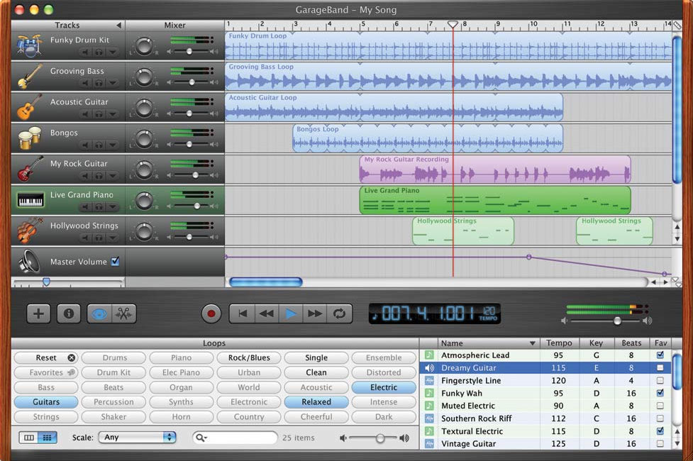
Next week we will be editing on Garageband our music because although we have experimented a lot, the music sounds like something you would listen to a club so we have been trying to find some vocals to go alongside the music. We also need to complete adding the credits over the boy and the girl's products.
Thursday, January 31, 2013
Credits
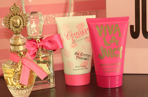
For the opening sequence it would be best if the credits for our opening sequence are shown onto the products of the girl and boy getting ready.
For example, for the girl's parts, while she is putting on her make-up some of the credits could be on her blusher, mascara, lipstick etc while the boys credits could be on his hairspray. I think this is effective because I found that while looking at some films which have their credits with no background action which I found very boring and ineffective. However, I think that for our target audience of 15- 25 year olds who are mainly girls, we need to make sure that we make it as interesting as possible in order to attain their attention and avoid making it boring.
For example, the pictures on this post is where the credits will go on top of them when showing the inter-cutting of both the two main characters. This also sets the scene as well because while looking at the girly products of different make-up and hair products, the audience would immediately know that this would be stereotypically a girl's bedroom. The use of colours therefore can give vital information away; such as whenever we've used pink and light colours, this represent the girls and the more darker colours represent the boy. This also makes it easily recognizable by the audience and we do not need to show their faces in order to tell them who is getting ready or which character we are showing.
.
31/ 01/ 2013
Progress-
Today we spent editing our opening sequence and continued working on making the footage flow together nicely. We need to still re-film some of our footage because of lighting issues so we will hopefully do it on the weekend.
Overall, today was successful as Nicola and Kirsten spent time finding the right music and have tried to create something on GarageBand which would fit when the girl and boy are getting ready. We have all decided that it would be best to have different types of music on the boy and girl so it appears like realistically what they might listen but also looks like diagetic sound i.e. they are actually listening to this type of music whilst getting ready.
Meanwhile, me and Natalie carried editing the sequence together; I think that the graphic match from the girl's red dress and his red bottle works really nicely and is visually entertainer/ creative.


Today we spent editing our opening sequence and continued working on making the footage flow together nicely. We need to still re-film some of our footage because of lighting issues so we will hopefully do it on the weekend.
Overall, today was successful as Nicola and Kirsten spent time finding the right music and have tried to create something on GarageBand which would fit when the girl and boy are getting ready. We have all decided that it would be best to have different types of music on the boy and girl so it appears like realistically what they might listen but also looks like diagetic sound i.e. they are actually listening to this type of music whilst getting ready.
Meanwhile, me and Natalie carried editing the sequence together; I think that the graphic match from the girl's red dress and his red bottle works really nicely and is visually entertainer/ creative.
Tuesday, January 29, 2013
29/ 01/ 2013
Here are some pics:
 | |
| Editing opening sequence |
 |
| On Garageband |
At the end of the lesson we managed to
complete a rough draft of what our music for the party scene would be
like which gave us all an idea of what it would sound like, what we need
to improve/ add in future lessons.
 |
| Our first draft of music we completed |
Monday, January 28, 2013
Progress
28/1/2013- So this weekend we have managed to
film all of our footage and this lesson we were looking through it to
make sure we have captured everything we needed or whether we need to
re-film. We have started to edit some of the bits of the footage and
some of us are using garageband in order to create the music for this
opening sequence.
We are planning to edit as much as we can all week, swapping around so everyone gets a turn to edit and have an input in this project.


We are planning to edit as much as we can all week, swapping around so everyone gets a turn to edit and have an input in this project.
Filming Day 2
On Sunday we completed out filming by
managing to film the boy's and girls parts with the party scenes.
Overall I think it was a successful day because we managed to get a
variety of different camera shots and varied them in order to apply what
we had learnt.
On Saturday some of the girls in our group had to 'dress' a room in order for the mis- en- scene to look like it's a boy's room. I think this was effective because we wanted to make sure that all the details were correct and it was realistically a room which a boy would be in. Here is a pic of the room:

For the girls part, again we tried to
stereotypically create a room which would be ideally for a teenage girl
in order to fulfill out genre of a romantic/ coming of age film. We made
sure the props were suited for this so we placed a lot of makeup,
magazines, perfume, etc which helped us achieve this aim.


For the party we had to dress up a living
room again and make sure that there was enough props in order to make it
look like a real party. Here are some location photos:


Overall, this weekend of filming and
setting up the rooms was successful because we managed to get a lot done
and the pre-planning (pre-production stage) of storyboards, costumes,
lighting was helpful because we know what we had to do or the types of
shots we wanted. Now we will be editing this and hopefully we have done a
great job!
Saturday, January 26, 2013
Filming Day 1
We did some filming on the 17/ 1/ 2013 which was quite successful as we managed to film some great shots of the main girl, Ruby.
What went well? : We had really good close-up shots of the girl such as of her eyes, close detail of her answering the phone etc. We had also filmed half of her face when she answers the phone because we didn't want to reveal her full face or outfit yet until she finally arrives at the party, which is why we filmed a lot of variety of extreme close-ups, close-ups and medium shots. We have also managed to film a point of view shot of her spraying hairspray on her face but towards the camera so its as if the audience are the main character. We will inter-cut this with the main guy as he is getting ready in order to make this more visually interesting.
What could be improved?: Whilst filming the main girl walking outside and going to the party, when watching this back it was quite dark and not as we hoped. To improve this we have arranged to re-film this on Monday the 28th of January in order for the viewers to see it clearer and improve the quality of our footage.
Here are some of the 'behind the scenes' of us filming for the first day:


What went well? : We had really good close-up shots of the girl such as of her eyes, close detail of her answering the phone etc. We had also filmed half of her face when she answers the phone because we didn't want to reveal her full face or outfit yet until she finally arrives at the party, which is why we filmed a lot of variety of extreme close-ups, close-ups and medium shots. We have also managed to film a point of view shot of her spraying hairspray on her face but towards the camera so its as if the audience are the main character. We will inter-cut this with the main guy as he is getting ready in order to make this more visually interesting.
What could be improved?: Whilst filming the main girl walking outside and going to the party, when watching this back it was quite dark and not as we hoped. To improve this we have arranged to re-film this on Monday the 28th of January in order for the viewers to see it clearer and improve the quality of our footage.
Here are some of the 'behind the scenes' of us filming for the first day:

Monday, January 21, 2013
Filming
We filmed last week the first half of out whole filming project which was the girl getting ready such as putting on her makeup and doing her hair for the party scene.
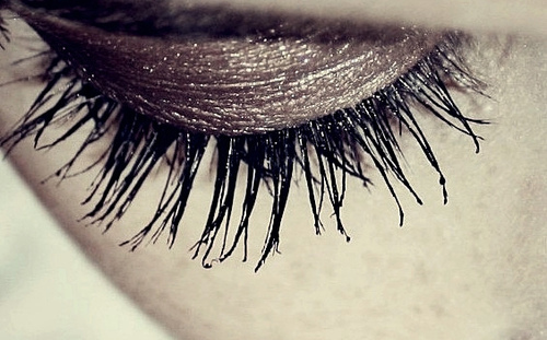
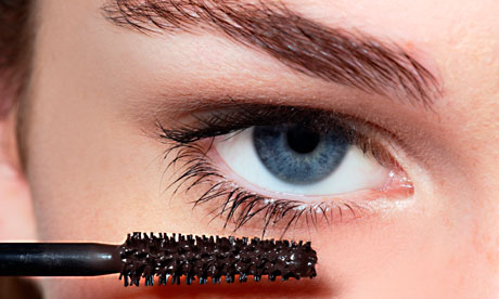
We decided that it would be best if we didn't show too much of the girls face but only extreme close-ups of the details of her face such as her eye. This would be effective because no one would have seen her yet until the final reveal at the party- building some tension.
Some shots we had done were like those:


We decided that it would be best if we didn't show too much of the girls face but only extreme close-ups of the details of her face such as her eye. This would be effective because no one would have seen her yet until the final reveal at the party- building some tension.
Some shots we had done were like those:


 | ||||||||
| For one of the shots we are filming the main girl, Ruby put her shoes on which would be a similar close-up shot like this one |
Thursday, December 27, 2012
Opening Sequence- Twlight
Camera movements
- Establishing shot of the forest- establishes the whole setting which is important to this film and we also focus on the animal-grabbing our attention
- POV (Point Of View)- running after the deer, the camera shots change really quieckly and we gets a sense of pace and action, gripping us right from the start but also inclusing us as we feel as though we are chasing after it.
- Continuity editing shots smoothly cut one shot to another to create a sense of fluidity which makes the action more realistic. The fast shots also go well with the fantasy genre which creates an exciting feeling.
- Tracking of the deer running along the forest we are able to follow it allong closely but the blurring action in the background highlights the speed at which its going.
- Close-up shots to see the character's facial expressions, escpecially as Kristen Stewart is narrating at the beginning we follow her expression as she narrates.
- Air view shot with the title credits which show us the whole of the setting which is important to the movie. We gain insight of what the place is like which appears extremly cold- effective because it echoes the vampires and one of their many qualities is being cold, sparkling ice creatures.
- The make-up of the main character is very limited and neutral to create a sense that she is a normal, ordinary girl. This is also important for us to see the contrast from her and Edward Cullen, who is a vampire.
- A lot of green scenary and wildness which contemplates well with what the stroy is about and the use of vampires.This can be effective because it goes well with the ramntic and fantasy genre of the twilight series.
- The music at the title credits is relaxing which creates a warm feeling to the openness of the movie and makes us feel relaxed. This is also good for the type of genre of the movie as they are important qualities.
Task 3- Editing Analysis of clips
- Establishing shot- opens up the scene and introduces us to where the action of the characters is taking place. We then have a master shot so we see the name and the exact place of restaurant, adding more information.
- We then have a long shot of all the characters and tables which is effective because we are shown all the places to establish the setting before we actually see the main characters. Then there is a cut of the two characters and this is shown through a long shot so we gain information of what they look like/ what they are wearing.
- Through the invisible editing we then cut to a close-up shot of her taking out a tag sticker out quickly and then moves back to the full long shot of the table. This can be an example of continuity editing called match on action because the shots are all different but seem to flow like one together.
- There is then the use of parallel editing where we see a different location of a man in the kitchen while we are still hearing the man at the table talking to the women. This does make the scene more unique but also ads some suspense as to why we are being shown this. This is also interesting as we can still see the man when we are shown a mid close up shot of the women. She appears to be slightly on the right which enables our view of the man in the kitchen- this may mean that he is important to the plot.
- We then get the shot-reverse shot of them having a conversation were as we see the women speaking we see his shoulder and the same happens in reverse. This creates a sense of intimacy as we feel that as an audience we are part of the two character’s conversation and the fluency of the shots reversing makes it more realistic.
- There is more parallel editing when we are shown from the mid close-up of the table scene, to the kitchen scene and then long shot of restaurant tables again creating more curiosity that the main two characters may actually be involved with the man they keep showing behind the restaurant.
- The rest of the scene mainly remains in shot-reverse shots as we gain detail of what they are talking about and are able to see their facial expressions and some of body language. The fluidity of this also enhances our interest and does not make it boring to watch.
Task 3- Editing analysis of clips
- The beginning of this scene starts off with a close-up shot so that we are introduced to both of the characters. The camera slows moves towards them to connect us more with them and for us to see their expressions better. The shot then changes from this close-up shot to a medium shot of half the bed by the technique of invisible editing so that we get a sense of fluidity. As the character t gets up, the camera pans from him sitting on the bed to him standing up and moving along his bedroom. This is effective because we are able to follow the action closely. This is similarly used when the women gets out of the bed- the camera pans upwards this time and follows her as she goes to check up on the baby, again keeping viewers close to the action. The shot used is a medium close-up so we are able to see the women’s facial expressions and we get a sense that she appears fed up and annoyed, making us curious as to why that might be.
- We are then shown a different location and the shot first introduced to us is the close-up shot of the flowers so that we can see the action of the character ripping out the petals showing her anger. Her anger is further showed when the camera pans up to a mid close-up of her talking on the phone and we see her facial expressions as being anguished.
- The camera on the next location tracks behind some objects which obscures our view from seeing the character in detail and adding more curiosity. The track is fairly slow at a speed which can exemplify that that’s the way the character is feeling: moody and depressed. The shot is then focused on his phone which appears to be a mid shot, so we get the impression that he may want to receive a phone call from someone, drawing us in as we want to find out who that person may be. The scene ends with a shot from his hand to a close-up of his annoyed face and by using continuity editing this makes it effective because it makes it realistic from the fluid editing. This can also be a match-on action because the two clips between his phone and his face may be shot a year apart but because of the invisible editing, it connects them.
- We are then shown a long shot of where the next scene is taking place which appears like a hallway and we are introduced to the next character. This shot is also filmed from a long angle and this normally makes the character higher status but in this case it could be a way of must making the scene more visually interesting because we then track closer to his face. We end up with a mid close up shot which shows his facial expressions and we are able to interpret his feelings/thoughts.
- This shot begins with a low angle shot of a women’s feet which is effective because we focus on what the character is focusing on to and get a sense of being part of the film- again making the programme feel like reality. We then finish with an establishing shot so that we can get a sense of where exactly we are, drawing importance to the setting.
Subscribe to:
Posts (Atom)